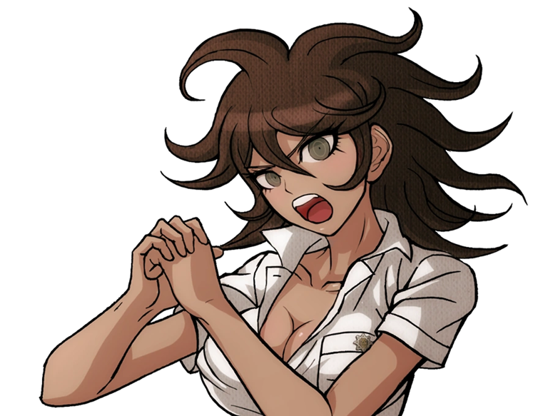
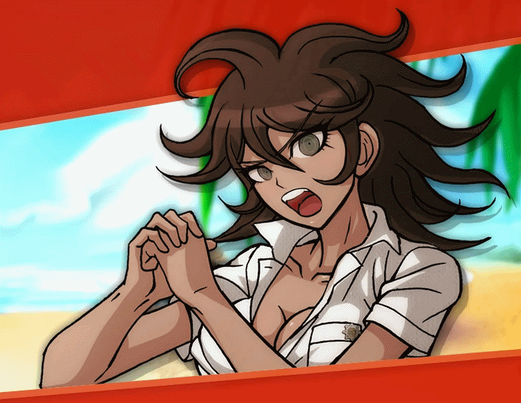
SDR2 Wallpapers; AKA: The Start of It All
In many ways, these wallpapers we are about to delve into was the start of it all: Of SDR2 beta sprites as we know them, and the precursor to my obsession with them. Of course, there is further context to that last one, but that will have to wait for the DRS article.
First, let's step back. What am I talking about?
As you likely know, Super Danganronpa 2: Farewell Despair Academy (or just Danganronpa 2: Goodbye Despair in the official English title) was released to Japan on July 26, 2012. But, before the release, the official Danganronpa website had created new pages to advertise the upcoming game. Of course, these days, the website no longer exists, and while some Wayback captures do, they're not in perfect shape, with many broken .SWF files being all that remains; some work better than others.
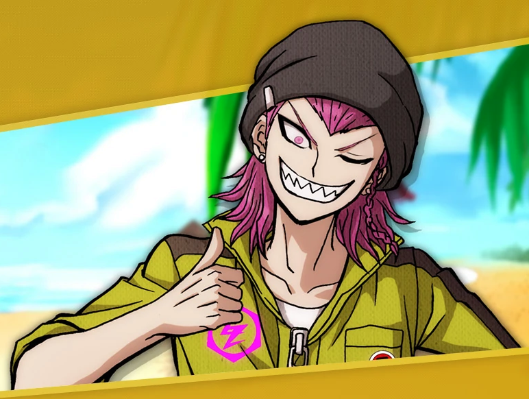
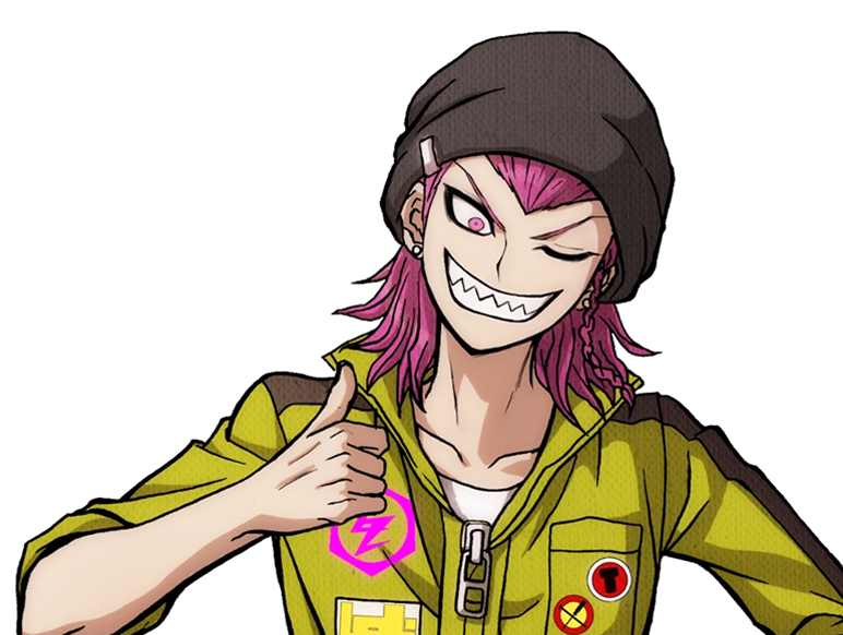
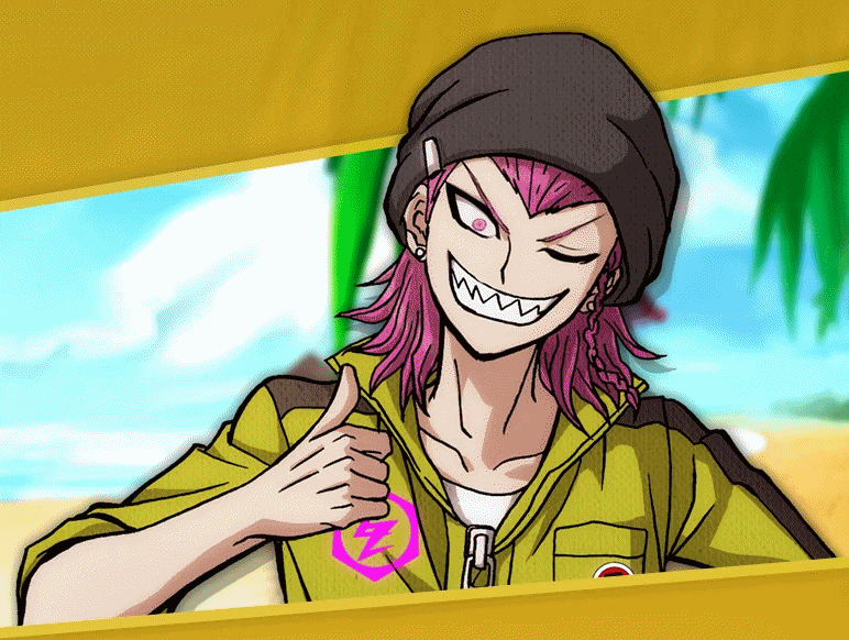
One of these forgotten pages was the Online MonoMono Yachine (Note: the reason the MonoMono Machine was called a "Yachine" in the second game is because "palm tree" in Japanese is "Yashi"; it's an untranslated pun). The gimmick of this little site was to dispense 3 digital images for download every 24 hours. For the purpose of this article, the items we are most interested in are the Twitter wallpapers (back before Twitter used those short, wide banners).
HOW DO WE KNOW IT'S REAL?
These days, we must rely on the Danganronpa wiki to access these old wallpapers, so it does rightfully beg the question: how can we be sure these are real? They taught you in school to never trust Wikipedia as a source, didn't they?
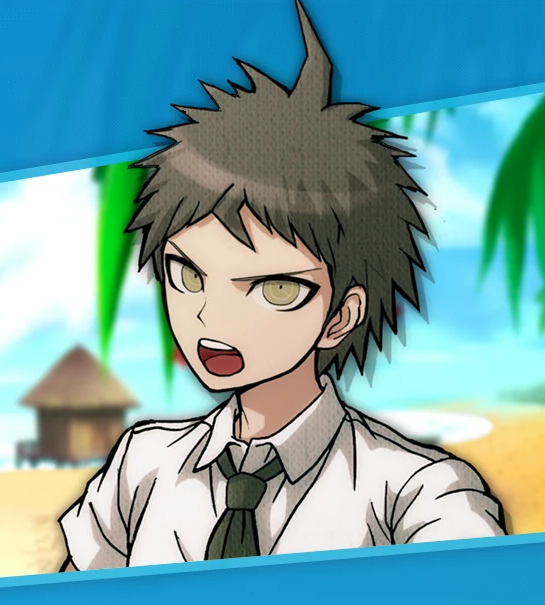
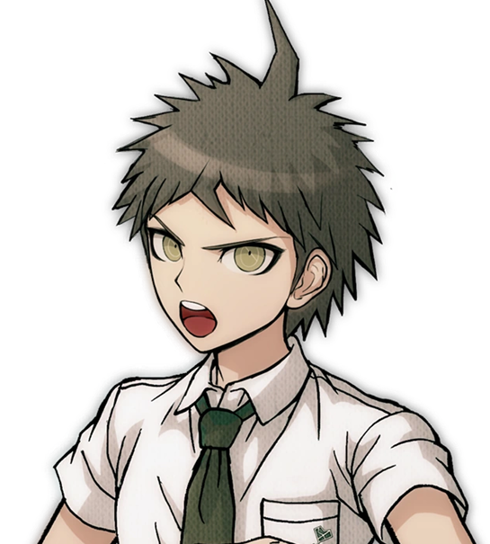
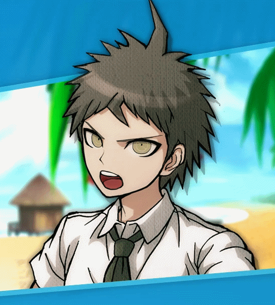
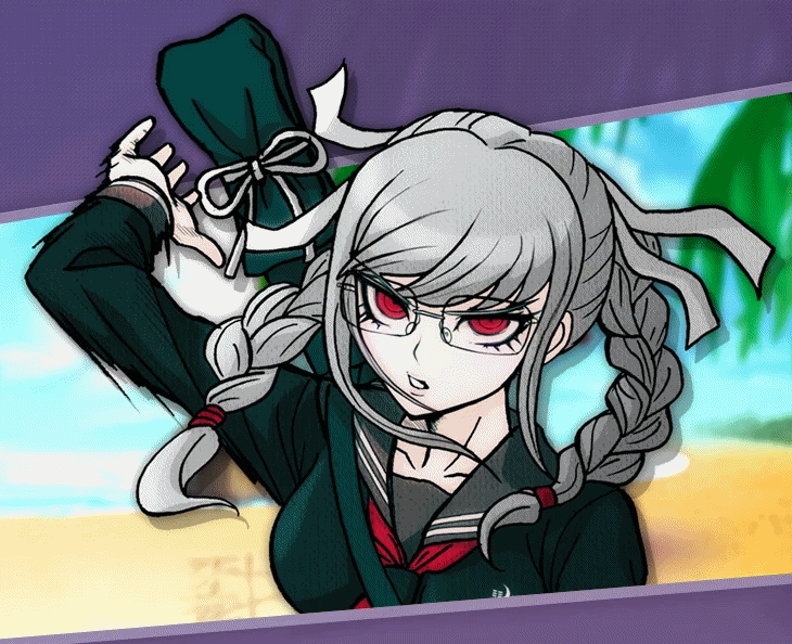
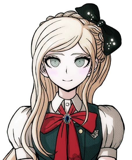
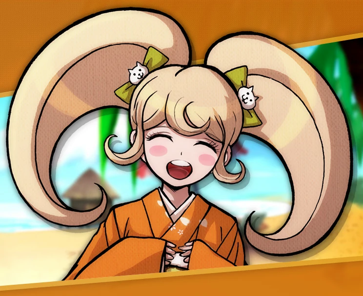
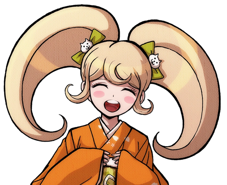
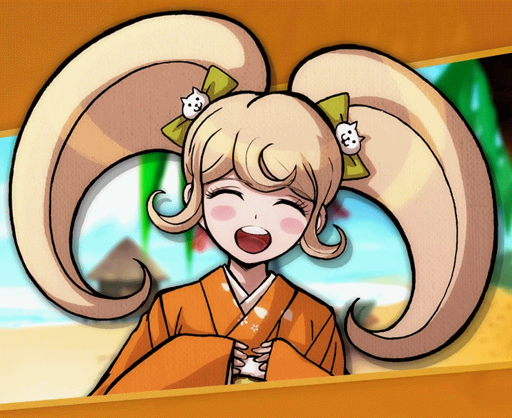
Luckily, this is very easy to prove for yourself! Here is a link to a Wayback archive of Hinata's introduction page. As you will see (both if you click the link or just look at the image below), the Hinata sprite used here is verifiably different to the one seen in SDR2. It also happens to be the exact same sprite used for the Twitter Wallpaper. This holds true for every character's introduction page in comparison to their Twitter background, but I'm only using Hinata as an example since, well...it'd be a bit excessive to post everyone else just to prove a point.
 |
 |
|---|---|
| Twitter Wallpaper | Intro Page from Wayback Machine |
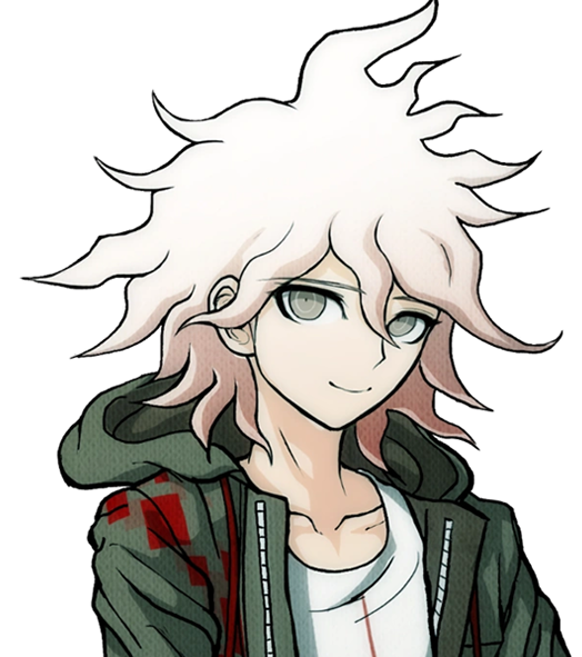
With that out of the way, I think it's safe to say these sprite we are about to look at are indeed betas. It's only fair, then, we focus on Hinata first.
 |
 |
 |
|---|---|---|
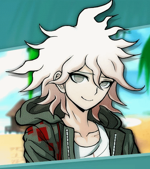
| Sprite used in Wallpaper | Final Sprite | Comparison .GIF |
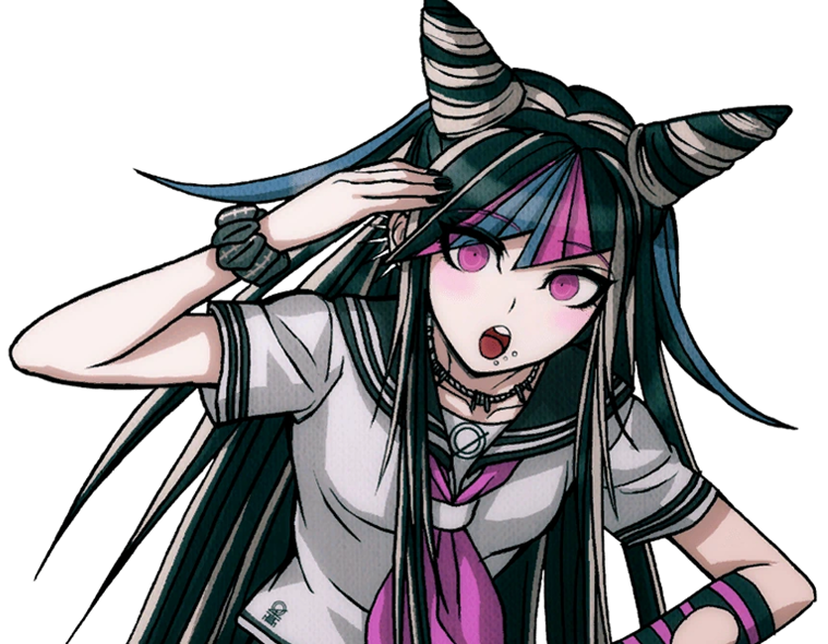
A lot is revealed with a simple GIF. Hinata's entire face shape was changed (including ears), not just his mouth. In fact, not just the shape of his face, but the face itself is drawn very differently in the end. The neck of his shirt was raised, as well as tie being redrawn (you can actually see where the new part begins somewhat sloppily; remember what I said about obvious signs of editing in the Starter Article?) Less notable but still apparent are his bangs being redrawn and shaded differently.
Keeping with consistency, let's check out Komaeda next.
 |
 |
 |
|---|---|---|
| Sprite used in Wallpaper | Final Sprite | Comparison .GIF |
Yet again, the differences are striking when flipped back and forth. Komaeda's face shape and ear was redone much like Hinata, but not to nearly the same dramatic extent. As well, his entire face was redrawn, notably erasing the black shading under his chin and shortening his eyelashes. Less noticeable, the hair touching his neck is shortened a bit, and the crease line on his hood is more well-defined. They also slightly changed the line art for the first fold in his shirt, the neck at the back of his shirt, as well as his leftmost bang. Interestingly, they either forgot or didn't care to fix the shading to reflect the new placement of these lines. His jacket also has some changes in line art weight.
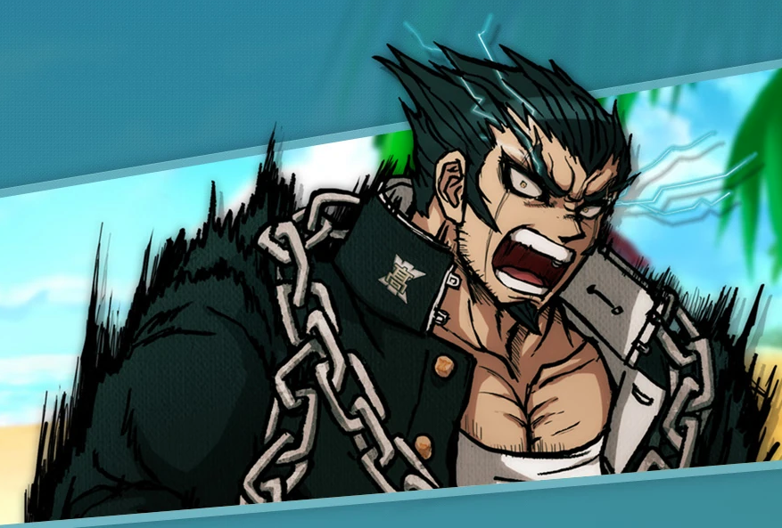
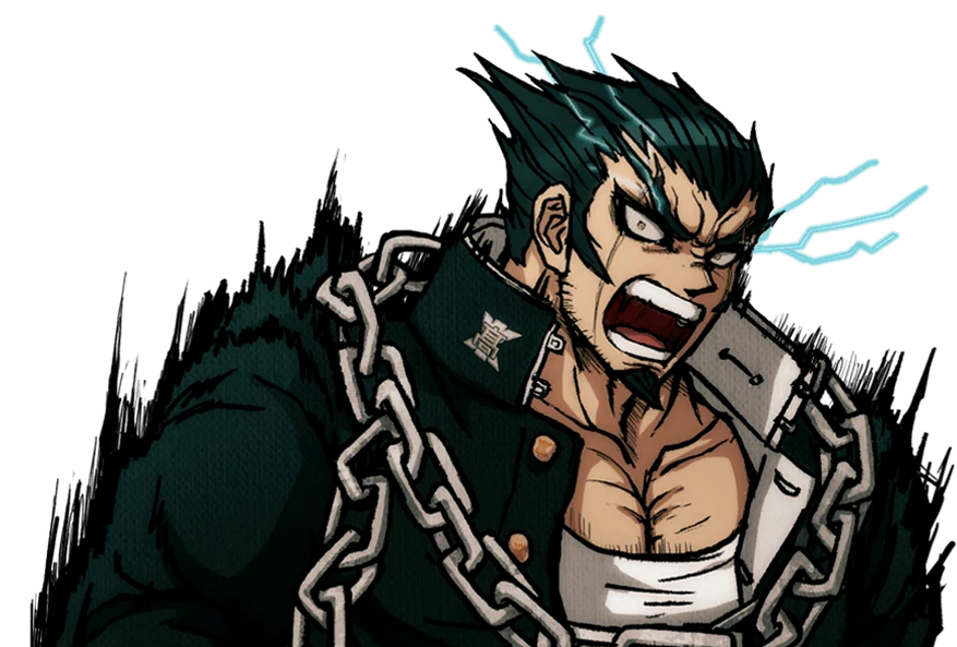
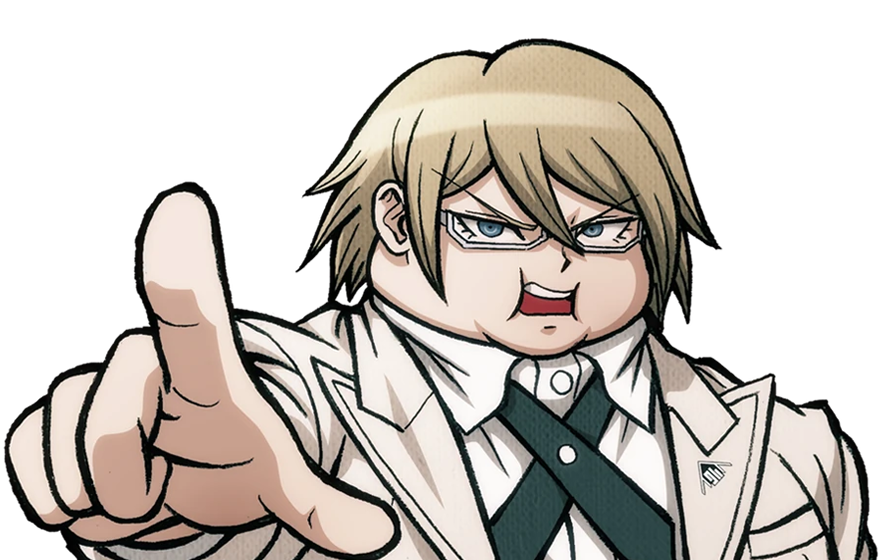
With Hinata and Komaeda out of the way, let's touch on Kuzuryuu.
 |
 |
 |
|---|---|---|
| Sprite used in Wallpaper | Final Sprite | Comparison .GIF |
This one honestly shocked me. Besides the added detail of him spitting, I didn't notice any difference right off the bat until I overlayed the images, but the differences are night and day. His eyes are made to be less mean and more skeptical. His mole was shrunk and his nose is more 3-dimensional. Extra detail is added to his ear while his hair is redrawn in whole, including it being slightly shorter. What's most interesting is the fact the body was sized up and moved down several pixels, I imagine to change the perspective. Some minor line changes are made to the white undershirt of his suit.
It would be improper not to do Pekoyama next.
 |
 |
 |
|---|---|---|
| Sprite used in Wallpaper | Final Sprite | Comparison .GIF |
Again, just like Kuzuryuu, I didn't notice half of these changes at first. Pekoyama's whole face is slimmed. The outer outline of her hair remains the same, but almost every outline inside of it, including her bangs, changes (although, her right twin-tail has a slightly longer end to it). Her outfit receives minor touch-ups, including a clothes fold on her breast and darker shading by her collarbone. Speaking of, her neck muscles and such have been redrawn. Most interesting to me is the fact Pekoyama's outline is noticeably thicker with action lines in the original beta sprite, but lack them in the final sprite as if somebody used the magic wand tool to edit the background out, editing away some of the jagged black lines in the process. She is the only character where this happens.
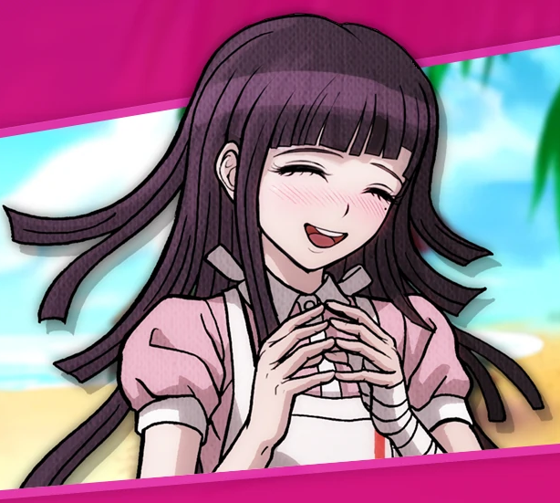
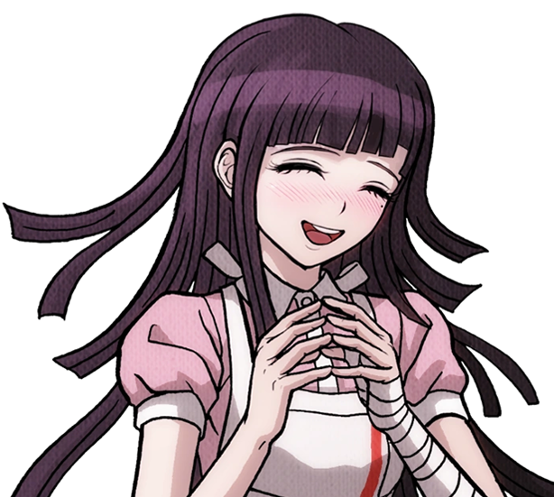
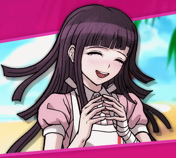
Since she is a major character, let's do Nanami now.
 |
 |
 |
|---|---|---|
| Sprite used in Wallpaper | Final Sprite | Comparison .GIF |
I wasn't surprised to find Nanami has virtually no difference about her. Her design was pretty much set in stone early on. That said, it's not entirely the same. Though very minor, the thickness of her left eye was increased at the top. As well, shading across her pinky finger was removed. There is also a chance her body is slightly bigger, but that's more likely to be a result of me failing to perfectly match up the two images.
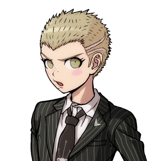
I want to focus on Souda now as he was the first one I did this test with.
 |
 |
 |
|---|---|---|
| Sprite used in Wallpaper | Final Sprite | Comparison .GIF |
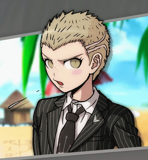
You know, when I first played SDR2, I thought Souda looked kind of scary. His beta is even scarier looking! I can see why they changed it...Every detail on his face is redrawn including his chin, notably his pupil was enlarged and his eyebrows were quirked. Funnily, it seems the clip on his beanie was redrawn, but like Komaeda, they didn't edit the color layer to match the new outline. Some minor line art changes were made to his back hair. The lines for his neck and collarbone were lessened, and the jacket zipper is made more three dimensional. His thumb was fixed too, as well as the lines on his hand.
Also, here's a fun thing I noticed a while back:

The sprite used for Souda in the Dangan Island opening is the exact same as the beta sprite! This would be the only time Westerners would catch a glimpse of some beta sprites until UTDP, as keep in mind, these wallpapers were exclusive to the Japanese Danganronpa website. In fact, Souda isn't the only one with a beta sprite in the Dangan Island opening. But, that will have to be covered in a later article.
Moving on...I guess it's only natural we look at Sonia's sprite next.
 |
 |
 |
|---|---|---|
| Sprite used in Wallpaper | Final Sprite | Comparison .GIF |
Changes like these ones are very interesting to me, because if you did not do a side-by-side like this, you may never see how many minor details were changed. A lot of Sonia's line art was redrawn to be more detailed, such as more lines in her hair, thinner outlines for her braid, and redrawn creases in her shoulders and bow (as well as a redrawn button). Her face is interesting as some very minor changes were made. Some detail is added to both ears (thicker outline on the right, changed line art on the left) and her left eyebrow is slightly edited. She was also given extra eyelashes on both sides. When it comes to such minor changes, it makes you wonder why they bothered at all. I wonder what the development looked like.
Let's finish off the last trio with Tanaka.
 |
 |
 |
|---|---|---|
| Sprite used in Wallpaper | Final Sprite | Comparison .GIF |
As you can see, Tanaka remains fairly faithful to his final sprite. The only differences I could spot were in his left hair streak being redrawn to fix the perspective. As well, a clasp on the inside of his suit collar was added. Besides these two changes, I actually think everything else is virtually the same.
Next is Nidai.
 |
 |
 |
|---|---|---|
| Sprite used in Wallpaper | Final Sprite | Comparison .GIF |
I must confess, when I first did this on my blog, I used the wrong sprite for Nidai...See, I had been using the UTDP sprites for being bigger and thus higher resolution. However, I did not realize that UTDP erroneously uses beta Nidai sprites. Where I thought the final SDR2 sprite seemed oddly less detailed, it was the other way around: I had been using a beta that snuck into UTDP when, ironically, this wallpaper uses the correct, final sprite. That was the day I learned that you can only use debut game half-bodies...
UTDP half-body sprites will be covered another day. For now, Nidai's wallpaper sprite is the same as his final one. Having spoken about Nidai, this would make Owari next.
 |
 |
 |
|---|---|---|
| Sprite used in Wallpaper | Final Sprite | Comparison .GIF |
Much like some of the other sprites I've talked about, I didn't realize just how many changes there were until I did this comparison GIF! Nearly all of her line art was redrawn in some way. The folds on her clothes, her chest pocket, her ear, her bangs, her hands, her neck, her chest, her face, and her right arm was given more muscle. To be honest, I kind of dig the mouth and chin of the beta sprite more! It was changed to be less sideways, I suppose. Her eyebrows were also toned down, her nose reshapened a tad, and her left eye was fixed to match the perspective.
Mioda's is another one I hadn't realized the amount of changes that were made.
 |
 |
 |
|---|---|---|
| Sprite used in Wallpaper | Final Sprite | Comparison .GIF |
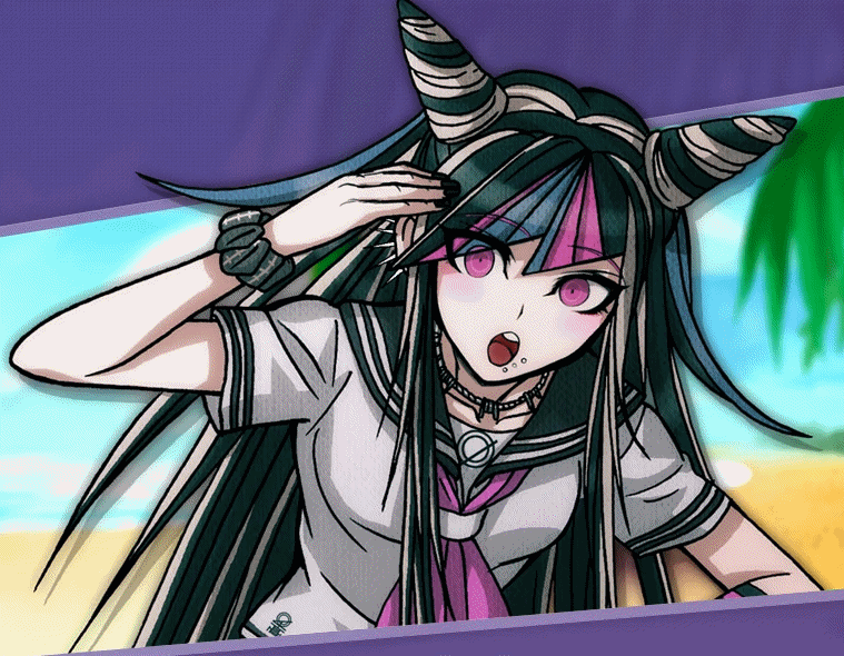
Like, look at this! Really different once you see it. She's one of the few characters where both line art AND shading were modified. Let's start with the minor stuff first. Her shirt folds have been changed, and the line art/shading combo on her chest was modified to make it appear smaller. The lines on her ribbon, neck, right sleeve, left sleeve, and left arm/hand were also changed. Detail from her hand was removed, I suppose to make her look more soft. Her bangs were modified slightly, and her left strand of hair was made slightly longer. The most notable difference, by far, are her horns. They were completely redrawn to have a different perspective and width to them. Her face, too, was changed. The eyelashes on her right eye were moved up, her nose moved down, her chin modified, and her left eye completely redone. Such major changes are quite crazy to see.
Koizumi is a somewhat interesting case, similar to Sonia.
 |
 |
 |
|---|---|---|
| Sprite used in Wallpaper | Final Sprite | Comparison .GIF |
For whatever reason, the final Koizumi sprite has its colors blurred. You can see the shading on her arms and shirt, for example, are brighter and have a slight bright rim around the edges in the final sprite. Around her eyes are also brighter. Oddly, a few beta DR1 sprites share this quirk, such as Fujisaki. But this is the final sprite for Koizumi. I'm unsure what to make of it. Besides the shading, it seems most of the changes are in line art width. Almost every line seems to have been altered slightly, either redrawn or edited to be thinner. Her hair is definitely the most obvious case of this, but her shirt, arms, and even eyes have had changes made to them. Besides the blurring, the shading itself doesn't seem to be modified. You can see this, funnily, by looking at the small white gap between her left overall strap and the shading of the shirt.
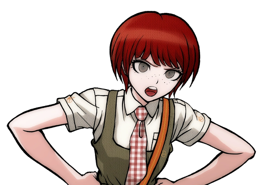
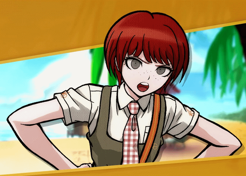
Next obviously would be Saionji, which is a good transition.
 |
 |
 |
|---|---|---|
| Sprite used in Wallpaper | Final Sprite | Comparison .GIF |
I say it's a good transition because these last few ones are undoubtedly the most dull. It seems that these particular ones have few to none differences with their final sprites. With Saionji here, the only difference I could spot was some removed line art on the edges of both her ears, with some a tiny bit above her right ear removed. Sadly, the changes become even less from here, but I'm going to discuss them anyways, of course.
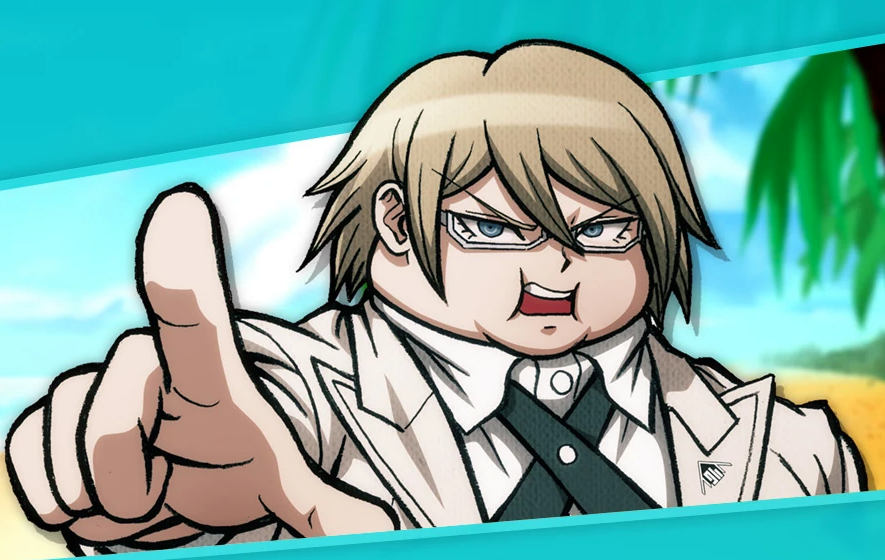
The last one who has discernible changes is Togami.
 |
 |
 |
|---|---|---|
| Sprite used in Wallpaper | Final Sprite | Comparison .GIF |
It's not just the .GIF format; Togami's shading was made noticeably brighter in the final sprite. Besides that, however, everything else seems to remain the same. The only exception I can spot is, oddly, a spot between his hair and shirt collar on the right where they filled the line art in. I suppose it's not a big shock that Togami's sprites were figured out early on, as the concept for Imposter Togami, much like with Nanami, seemed to be settled on very early in development.
These last two I'm putting together, since they both seem to have no visual differences.
 |
 |
 |
|---|---|---|
 |
 |
 |
| Sprite used in Wallpaper | Final Sprite | Comparison .GIF |
I looked for a long time, but I couldn't find a single difference between the wallpaper sprite and the final sprite. There are two spots in Tsumiki's hair that are dark in the beta versus the final, but I can't tell if that's because they were gaps erroneously filled in with her hair color, or the dark shading that we see behind the sprites of the wallpapers making those particular spots darker-looking. Either I'm overlooking something, or both Hanamura and Tsumiki had their sprites finished before the others (or just these particular sprites).
And there we go! This was originally the first ever beta sprite comparison I had ever done. In the years since, I've grown very familiar with all these sprites, and with all the wacky places they show up in. But, even so, I'm still fascinated with them like I was back then. It's always interesting to see beta content of something you love, and especially in art like this; it makes you wonder why certain changes were made. While sometimes it can be explained as poor artwork being cleaned up, other times it seems arbitrary, which raises a lot of questions. I suppose my never-ending need to seek out these sprites and document them ultimately comes back to me wanting to find the answer to that question. If nothing else, it's just for the sake of finding something cool and sharing it with the world.